A chart in Excel is a visual representation of data. It allows you to see patterns and trends in your data, which can help you make informed decisions.
There are several types of charts in Excel, such as bar charts, line charts, pie charts, and scatter plots. Each type of chart is best suited for different types of data and different purposes.
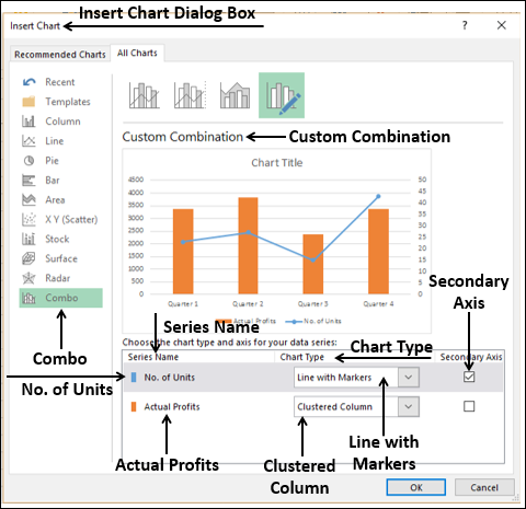
To create a chart in Excel, you can use the “Insert” tab on the ribbon and select the type of chart you want to create. You can then customize the chart by changing its appearance, adding data labels, and adjusting the chart’s axes.
For a user to create a chart, follow the below:
1. Select or highlight the data you want to apply the chart to
2. Click the “Insert” tab.
3. Click the “Chart” button.
4. Make an option by selecting the chart type or kind you want to apply
5. Click the “OK” button.
You can then customize the chart by changing the chart type, the data range, the colors, and the labels.
Here are some tips for creating effective charts in Excel:
*There are many different types of charts available in Excel, each with its own strengths and weaknesses. Choose the chart type that will best represent your data and make it easy to understand.
* Use clear and concise labels. The labels on your chart should be clear and concise so that readers can easily understand what the chart is about.
* Use colors effectively. Colors can be used to highlight important data and make your chart more visually appealing. However, be careful not to use too many colors, as this can make your chart look cluttered.
* Keep it simple. The best charts are simple and easy to understand.
About Author
Discover more from SURFCLOUD TECHNOLOGY
Subscribe to get the latest posts sent to your email.